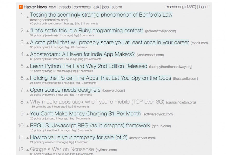
A while back I restyled Hacker News using the Stylebot extension for Chrome. Initially I just wanted to apply a fixed width, as the site's fluid layout can result in some very long lines on a large/wide display.
Over time I added in some other usability improvements, such as:
- larger 'vote' buttons with more space in between them, which helps to avoid mis-clicks on the downvote arrow (a common complaint on HN)
- stronger delineation between unread and read articles, using a faint cyan highlight on those which are unread, while read articles almost fade into the background
- monospace fonts optimised for code
Works best with Helvetica Neue and Menlo installed (as they are by default on Mac OS). Alternatively, Anonymous Pro will be used for code if installed.
Vote arrows use the CSS border based triangle technique.
If you want to use the theme yourself you can grab it from Stylebot Social.
